QUESTION 11 (12 marks)
Analyse Sources 1–3 in the stimulus book to explain the impact of electricity prices on small and medium-sized businesses over the years 2014 to 2019. Draw a short-term AD/AS diagram in the space provided to support your explanation.
Stimulus book
Source 1
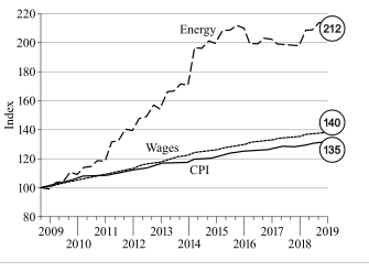
Energy prices compared to CPI and wage growth in Australia
Source 2 Analysis of small business retail energy bills in Australia, 2019 Small and medium-sized enterprises (SMEs) contribute more than 60% of the industry value added in the Australian economy. For SMEs, the cost of electricity and gas has significant implications for both employment and economic growth.
Source 3
Business in Australia by size, 2019 (estimated)
Number of
Number of
employees
businesses in 2019
Employment
’000 % of total
% of total
Small
0–19
2046
96
47
of which
0 1306
61
1–4
509
24
5–19
231
11
Medium 20–199
81
4
23
Large
200+
6 0.3
30
Total
2133
100
100
QCAA guide · typeset solution
QCAA sample response and mark allocation
Short response
Q | Sample response | The response: |
11 | Between 2009 and 2019, price inflation in the Australian energy market outstripped increases in wages and the general price level. CPI and wages have steadily increased by an average of 37 index points. The rate of change of energy prices over the same period has been more dramatic, with prices more than doubling in 10 years, including a 30-point hike in one quarter of 2014. Since then prices have fluctuated within a 10-point range. The overall trend in these prices indicates a structural change in production costs for all businesses, as energy is not a discretionary cost for businesses. Small and medium-sized businesses would be under significant pressure from energy price rises. These businesses are a significant part of the Australian economy, employing almost 70% of the workforce and representing 60% of the value added to the Australian economy. As electricity costs rise, businesses cannot afford to supply the same quantity of product at the same price, so some firms may have gone out of business or reduced production. The result of this would have been a shift in the aggregate supply curve from AS1 to AS2 in the diagram. All things being equal, the result would be higher prices (P2) and less gross domestic product (Q2). | Diagram |
• accurately draws the AD/AS diagram [1 mark] • accurately includes title and axis labels [1 mark] • draws AS2 shifted inwards and links the explanation to the diagram [1 mark] | ||
Trends (Source 1) | ||
• identifies ↑ trend in energy prices in 2009–2019 [1 mark] • quantifies trend in 2014–2019 [1 mark] • quantifies one ↑ trend in CPI and wages [1 mark] • infers a relevant effect of ↑ energy prices [1 mark] • calculates a number to make meaning [1 mark] | ||
Effect (Sources 2 and 3) | ||
• explains an effect of ↑ energy prices on SME employment [1 mark] • includes relevant details in the explanation [1 mark] • uses data from Source 2 in the explanation [1 mark] • uses data from Source 3 in the explanation [1 mark] |
QCAA sample response and marking criteria reproduced from the official guide.
Compare your working with the guide above.